Use this content type for initiatives and programs that are self-contained and separate from other site content. Navigation links are manually curated.
The following paragraphs are the different "lego pieces" that you could use on this page
The rich text paragraph will meet most content needs. Use it to add text and headings, create links and lists, add columns and single buttons, and embed images, videos, and documents. Most web pages should include a rich text paragraph, and in many cases, it may be all that is needed.
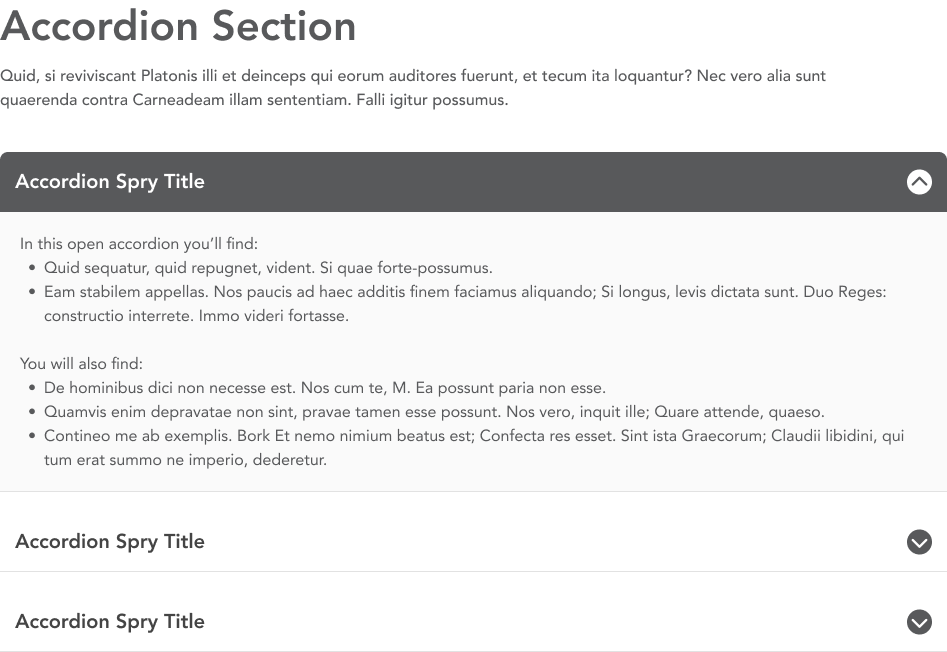
Create collapsible sections of text to help organize and present content in a compact manner to build more skimmable pages. Users expand accordions to find the information that matters to them. Individual accordions include a title that appears when it is collapsed and a body that appears when it is expanded.
Created a curated group of buttons with the CTA buttons paragraph. CTA (or call-to-action) buttons appear in a grid layout and are particularly useful for topic navigation pages, directing users to content deeper in the website. Buttons can be linked to internal pages or external URLs.

Use the directory paragraph to provide contact information about individual people. It references the People content type, displaying a person's name, title and contact information.
Use the embed paragraph to display external webpages in an iFrame on your site.
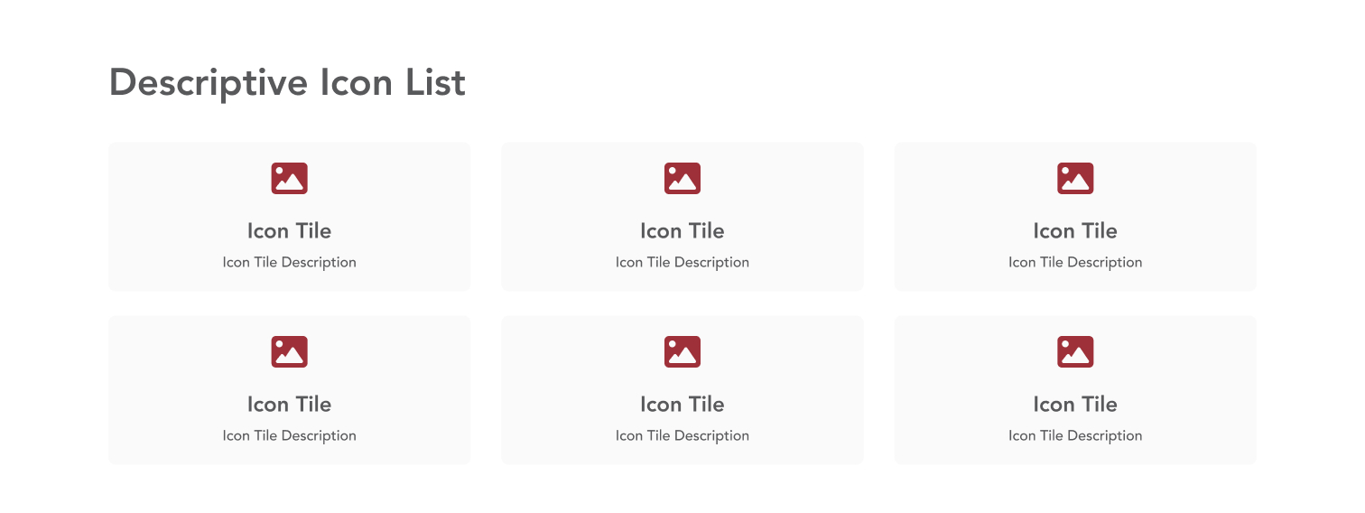
Curated group of unlinked icon tiles that display an icon, title and optional description. This paragraph is available on Department, Landing, and Campaign pages.
Connect users to content elsewhere on the website with the featured content paragraph. This paragraph creates a card display for related content using that content's title and image.
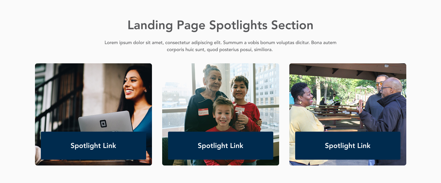
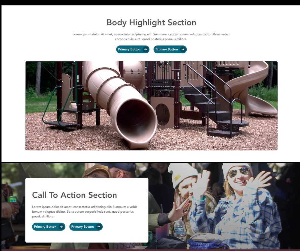
Feature important information with the highlight content paragraph. This paragraph is available to be used in the content section of landing pages, department pages, and the homepage, and is also used in the CTA Section tab for all content types. The paragraph includes an image, heading, description, and buttonlink(s).
Create a curated group of links with icons to help users find important or frequently-accessed content. Icon links are arranged in a grid, and the links can go to internal web pages or external URLs. Descriptions are optional, and best practice is that all icon links in a group should match.

Make your data visual with the icon stats paragraph. This paragraph highlights statistical data by combining the number with a description and related icon.
.png)
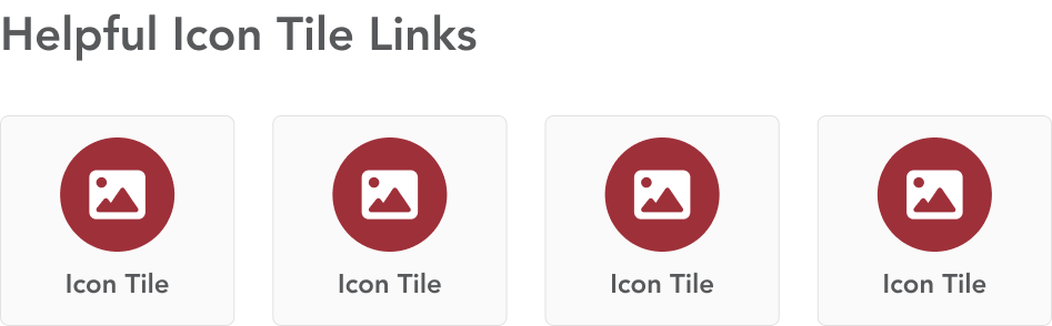
The icon tiles paragraph combines link text and an icon to help guide users helpful information or frequent tasks.
Jump links are a dynamic navigation feature used on long web pages. This component automatically generates a list of links that correspond to different headings within the content. When a user clicks on one of these links, the web page scrolls to the corresponding section, improving the user experience by allowing quick and easy navigation.

Display group of images on a page using the photo gallery or slider gallery paragraphs. The photo gallery paragraph places images in a grid, while the slider gallery creates an image slider to display one image at a time. Galleries must first be created in the Media Library.
.png)
Add social media icons in a line to a page. The icon is automatically selected by the system based on the URL entered. The link text should be descriptive, as it's used for accessibility.

Use the step process group paragraph to help guide users through a specific, complex process or procedure. This paragraph features clear, bold numbered steps that allow you to present complex tasks in smaller, more manageable steps. The steps are presented in a sequential order, with clear titles indicating what needs to be done at each stage.

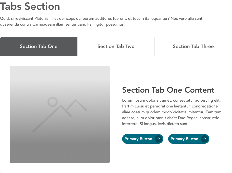
Divide content into different labeled sections using the tabs paragraph. Group related content in one tab panel, and use concise, descriptive labels.